


Exemplary
Customer
Service
Customer
Service
Experience personalized
service in-store & online
service in-store & online

Take Advantage
of In-store
Pickup
of In-store
Pickup
Reserve items online & pick
them up at your convenience
them up at your convenience

Our Price
Match
Guarantee
Match
Guarantee
We'll match others' prices on
nearly all our products
nearly all our products


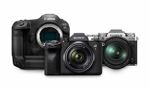
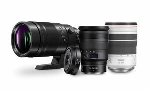
We're An
Authorized
Dealer
Authorized
Dealer
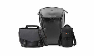
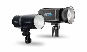
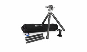
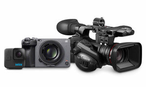
Manufacturer support & warranties
protect all our products
protect all our products