
There are two types of "teaching" professionals in my estimation. Those who teach to teach, being compensated because they teach well, and those who teach to be compensated. This can further be broken down into those who are "good" at teaching and those who are mediocre. I make these generalizations (and I realize that they are gross generalizations) because I feel like Guy Tal (www.guytal.com) is a photographer who teaches so that people will learn. I sense this through the amount of information that he puts forward and in the careful subtlety of how he explains his points. He is not threatened by competition, and he can therefore unlock some doors for you that may have seemed confusing at first. With Guy's permission, I will selectively present some brief paragraphs from his new eBook Creative B&W Processing Techniques. These are meant to both give you a few hints at the process, and of course, give you a taste of the book itself.

INTENDED COLOR FILTER USE (PAGE 34)
"As I discuss in the next chapter, in order to convert the color image into B&W, we need to instruct Photoshop on how to map various colors into shades of gray, or tones. For example, the blue sky in a color image can be rendered very dark or very light, depending on the visualized intent. In the film world, this mapping from color to tone is controlled to a large extent by the use of color filters. In Photoshop, we find a similar methods used that mimics the effect of these filters, but with far greater precision and variation than can practically be achieved using physical ones."
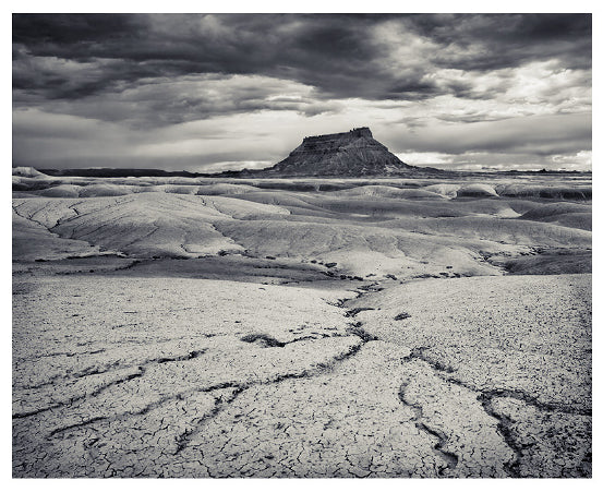
RAW CONVERSION (PAGE 49)
"As mentioned in the RAW Conversion chapter, my goal in the conversion phase was to create a good starting point for editing. I deliberately lowered the contrast by using the Shadows and HIghlights tools to extract detail from the dark butte [seen below] and tone down the bright highlights in the sky. I also set my color balance using the Tint and Temp controls so that a hint of blue remained in the sky, and the foreground was predominantly yellow. In doing so, I took into account my intent to later convert the image into B&W using a yellow filter effect, slightly darkening the sky and lightening the foreground. You will note that the plays of light and shadow in the mid-ground are not as pronounced in the RAW-converted image. Given that they are only important in a portion of the image suggest that they will best be handled by a local adjustment, which I always prefer to apply in Photoshop rather than Lightroom, for reasons explained above (see Page 32)."

BEFORE PROCESSING (PAGE 49)
"The first thing I do when opening an image in Photoshop is review it carefully at 100% magnification, scroll through the entire image area, and correct small defects such as sensor dust spots, distracting elements intruding from the edges, etc. Next, I translate the terms highlighted in the previous section into things I use to guide my processing decisions. For example: "drama," in this case, is illustrated through the use of high contrast; "heavy" clouds visually translates into dark clouds, etc. From here, I proceed to a series of iterations, each beginning with a quick analysis, followed by a range of global and local adjustments."

ICC PROFILING (PAGE 55)
"Those already familiar with making color digital prints may assume that all one needs in order to make accurate B&W digital prints is an ICC profile. This is, unfortunately, not always the case. The greatest hurdle to using ICC profiles is color neutrality. When an image needs to appear in pure shades of gray, any deviation from the perfect blend of inks, even if a tiny one, will result in a visible color cast. This is not an issue for color prints where such minute deviations will still be close enough to true color so as not to be noticeable. In theory, a perfect ICC profile will be able to accomplish a perfect blend of ink for neutral tones, but producing such a profile is not always practical. Consider that color calibration is dependent on such things as ambient temperature, age of the equipment used, and manufacturing tolerances for inks, and it's easy to see how even a perfect profile will not remain perfect for long. To overcome this issue, professional inkjet printers often will have three or more neutral (pure gray/black) inks that can be dithered in various patterns to produce a very wide range of shades. Printer drivers, however, don't always offer a way of limiting the printer to use just its neutral inks. The ones that do will often rely on proprietary technologies such as Epson's Advanced B&W (ABW) that regrettably do not utilize ICC profiles…"
His new eBook Creative B&W Processing Techniques can be purchased for $9.95 from his website.
Book: Creative B&W Processing Techniques
Author: Guy Tal
Year: 2012
Format: eBook (PDF)
Pages: 59
Cost: 9.95 USD
RELATED ARTICLES
Digital Workflow eBook Updated for Lightroom 4.1 and Photoshop CS6
Why Shoot With a Prime Lens?
How Do I Clean My Sensor?