
If you’ve taken an art or design class, then most likely you have heard of color theory. The Color Theory has been around since 1666 when Sir Isaac Newton came up with the color wheel. Color is a principle of design that is the foundation to any photographer's work. Color, like in any work of art, can evoke emotion and help tell a story.
Color and light work hand in hand in every photograph. The simple science behind color, also affects how we perceive light. Objects absorb certain wavelengths while reflecting others, and those visible spectrum wavelengths that are reflected back, are translated by our brains to represent the color of the object. So how can you take advantage of color theory in your photography? Well, the first step is to understand the color wheel and how colors interact with each other.
Understanding the Color Wheel

The color wheel consists of 12 colors: 3 primary, 3 secondary and 6 tertiary colors. If you split the color wheel in the middle from top to bottom, you will separate the warm colors from the cool colors. As you can see from the image above, the three primary colors are red, blue and yellow. Secondary colors made are made when the primary colors are mixed: Green, purple and orange. Tertiary colors are the secondary and primary colors mixed. Understanding how each of these colors interact with each other is based on color schemes.
Understanding color schemes is a huge asset when it comes to composing an image. The color schemes we will be going over include: Complementary, Analogous and Triadic.
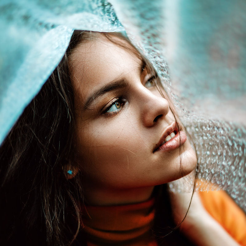
Complementary

Complementary colors are two colors opposite of the color wheel. For example, red and green or blue and orange. When combined, these two colors provide contrast and a pop of color. It often creates a more dramatic look and makes the other color look more active.

The complementary warm orange and cool blue tones on this portrait play off each other adding contrast and depth which is eye catching and dynamic. This is also a great example of why these blue/orange cine-tone edits are so popular in Hollywood blockbuster movie posters as well.
Analogous

Analogous colors are colors that sit right next to each other on the color wheel. This type of color scheme provides harmony and gives the photography flow. Unlike complementary, analogous creates a more smoothing look in which one color dominates, one color supports and the other color accents.

The analogous color grouping here uses darker tones to accent and highlight the bright green of the shoe. The dark green background also adds to the tone of the image and helps accent the brighter shoe without distracting from the main subject.
Monochromatic
Monochromatic is different tints, shades and tones of a single color. Tint refers to adding white to a color, shade refers to adding blacks and tones can be both or gray. This provides an artistic, painterly type look with textures, shape and similar dynamic range.

The monochromatic use of blue in this images heightens the appearance of the texture in the image and keeps the tone in line with the photographs intended mood.
Triadic

Triadic colors are colors evenly spaced throughout the color wheel. These tend to capture vivid colors and stories. It can emphasize lots of motion, strong features and can fill the space edge to edge.

The use of triadic colors on this top down food shot helps create a sense of balance in the image and a balance in the meal being presented. The colors are vibrant and play off each other in the same sense the ingredients combine together to make a pleasing delicious meal.
Color Psychology
There are also emotions and feelings associated with certain types of colors. Above we mentioned warm and cool colors. Warm colors like red, orange and yellow tend to evoke feelings of warmth, energy, and action. In terms of food people relate it to foods like soups or hot cocoa. Red is actually the shortest wavelength which makes it stand out to the human eye.
On the other hand, cool colors can evoke calm, peaceful or serenity-like feelings. When it comes to food, we think of ice cream and compared to red, blue is the longest wavelength which makes it have more of a soothing look. Color psychology has had a huge impact in marketing and advertisers use this to their advantage when creating ads to appeal to customer's emotions.
Storytelling
After you have a good understanding of color schemes and the color wheel, knowing good subject placement and framing can really help tell a story. No matter whether you're capturing still life, portraits, or landscapes, knowing where to place certain colors in your images will give you more emphasis on what you’re trying to illustrate. For example, choosing more monochromatic colors in a still life photo might convey a classic, clean style, or choosing an analogous color as a seamless background to emphasize the product and branding.
A solid knowledge of color theory applied in your photography will turn many more of your shots into stunning photos where you nailed the shot instead of trial and error until you get a winner.
1 comment
Jean
Your info is wrong. RED has the longest wavelength. Blue the shortest.